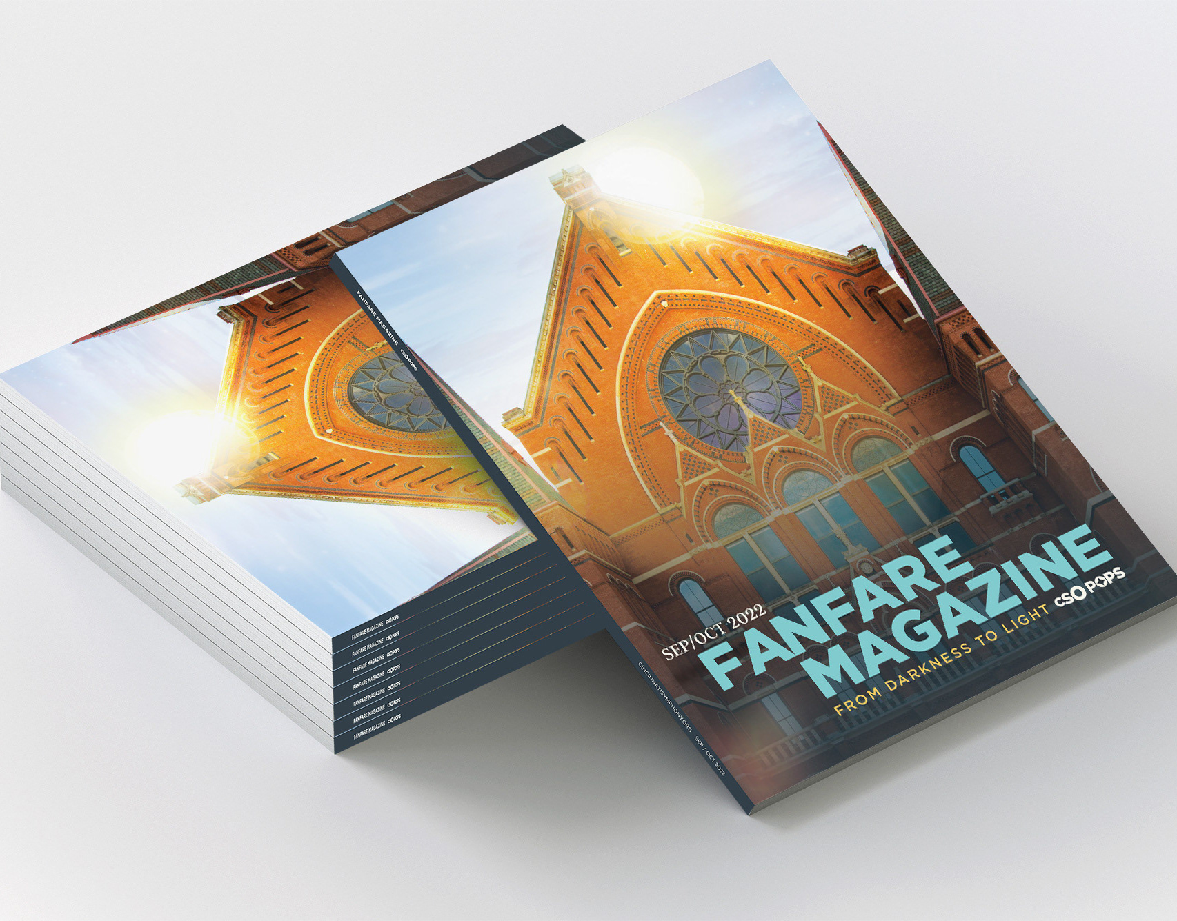
Client: Cincinnati Symphony Orchestra (CSO)
Project: Chamber Series Visual Identity
Type: Branding / Print & Digital Collateral
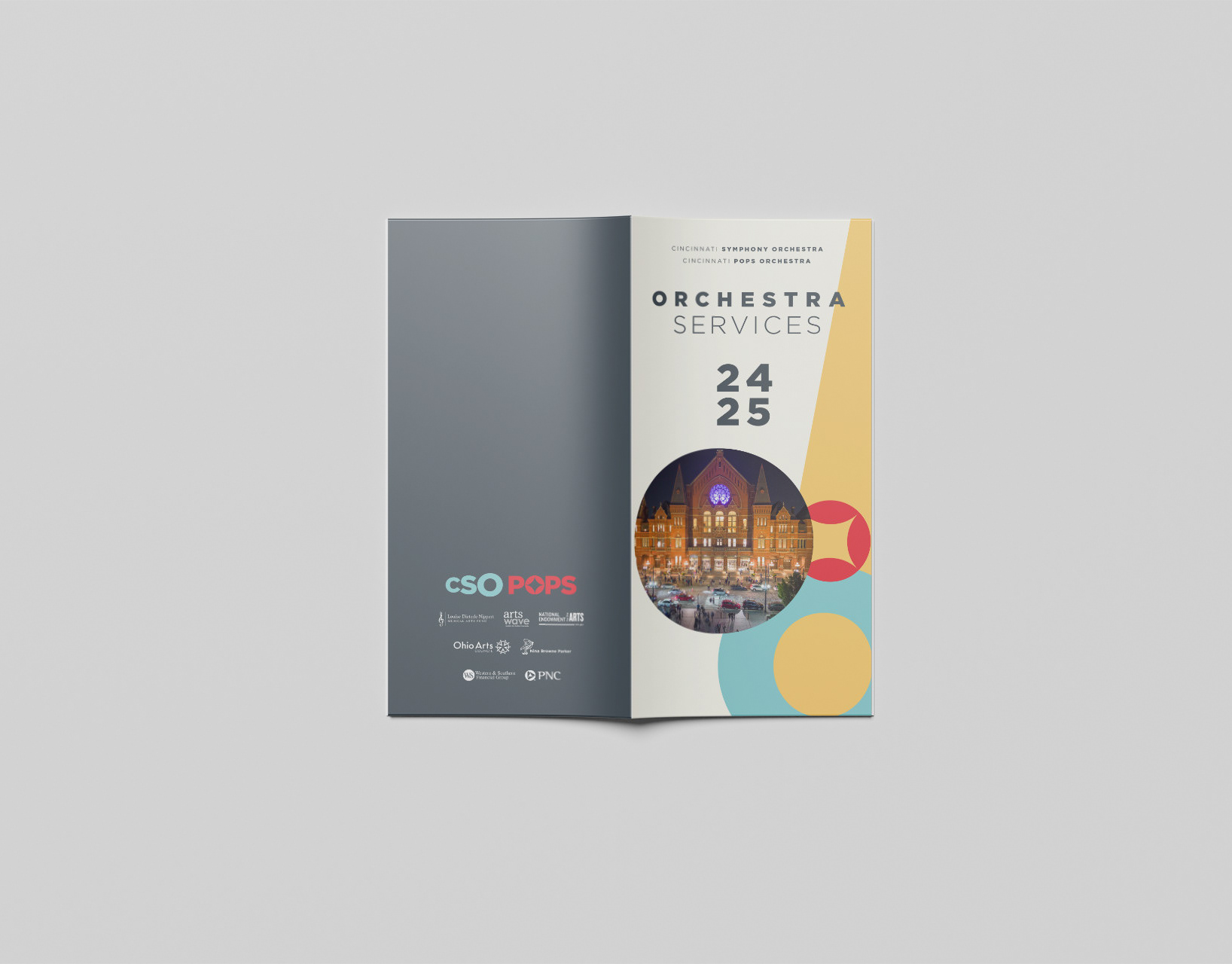
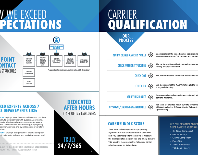
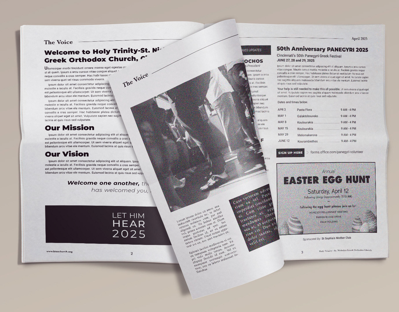
Size: 6 x 9 bi-fold / full color
Tools Used: Adobe InDesign & Photoshop
Project: Chamber Series Visual Identity
Type: Branding / Print & Digital Collateral
Size: 6 x 9 bi-fold / full color
Tools Used: Adobe InDesign & Photoshop
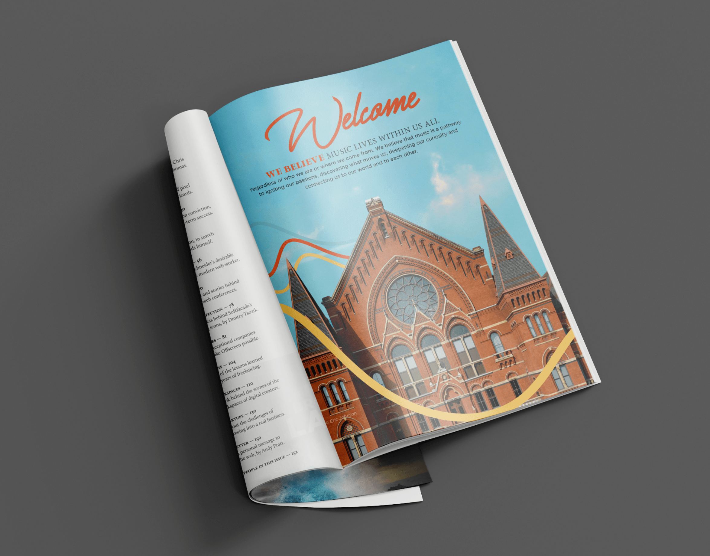
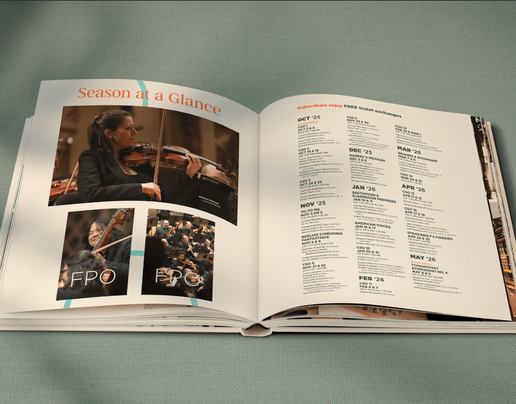
Objective: To create a distinct visual identity for the Cincinnati Symphony Orchestra’s Chamber Series that felt intimate, refined, and aligned with the broader CSO brand. The goal was to differentiate the series from main stage programming while conveying its unique setting, scale and musical experience.
Role: As the lead designer, I developed a comprehensive sub-brand system for the Chamber Series, including logo treatment, color palette, typography, and imagery style. I worked closely with the marketing team to ensure the visual direction honored the CSO’s master brand while giving the Chamber Series its own elegant, understated personality.
Deliverables included:
• Poster and flyer templates
• Program inserts and print ads
• Web and social graphics
• Typography and layout guides for internal use
• Poster and flyer templates
• Program inserts and print ads
• Web and social graphics
• Typography and layout guides for internal use
I also managed pre-press preparation and digital formatting to support cross-platform consistency.
Results:
• Successfully launched a cohesive visual identity that elevated the Chamber Series as a distinct and recognizable offering
• Received positive feedback from CSO patrons and leadership for its refined tone and clarity
• Strengthened seasonal attendance and interest by visually framing the series as an intimate, high-art experience
• Served as a template system for future chamber or specialty programming
Take Away: This project underscored the importance of sub-brand development within a legacy institution; maintaining cohesion while giving space for individual programming to shine. The Chamber Series branding balanced tradition and sophistication with a modern, clean approach to elevate the concertgoer experience from the first visual touchpoint.
