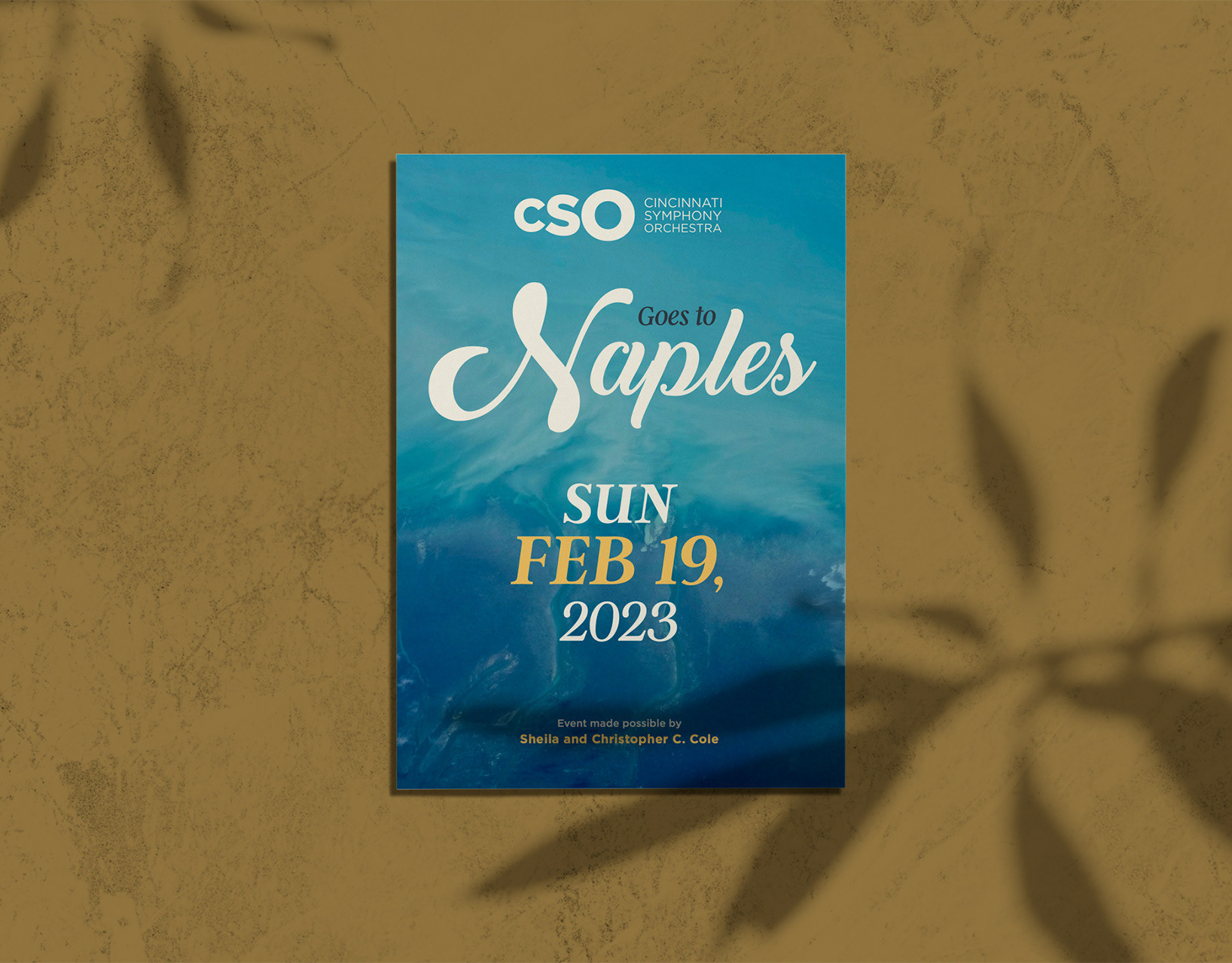
Client: Cincinnati Pops Orchestra
Project: Lollipops Series Postcard Design
Type: Print & Promotional Design
Card Size: 5x7 / two-sided
Tools Used: Adobe InDesign, Illustrator, Photoshop
Project: Lollipops Series Postcard Design
Type: Print & Promotional Design
Card Size: 5x7 / two-sided
Tools Used: Adobe InDesign, Illustrator, Photoshop
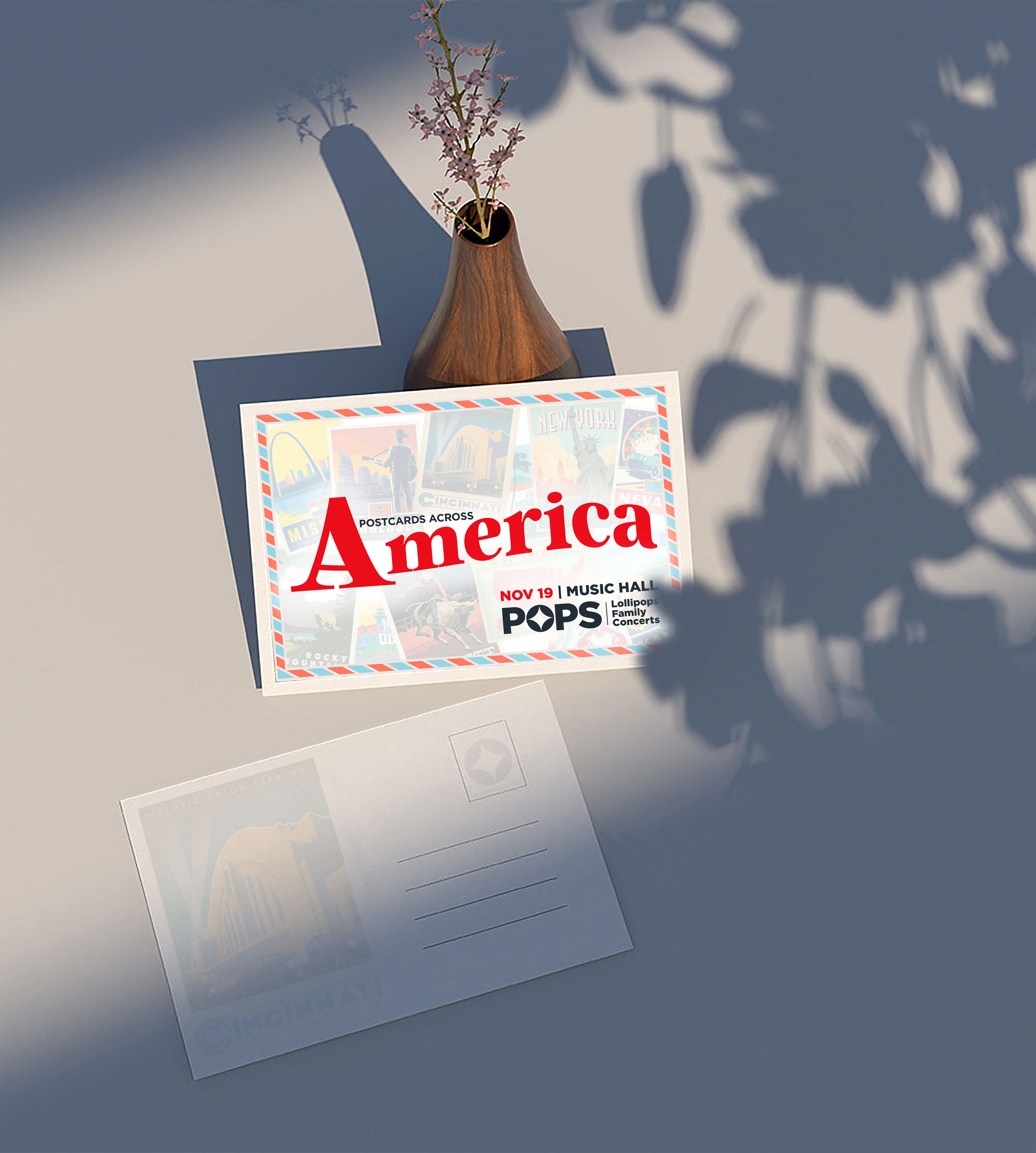
Objective: To create a playful, engaging postcard promoting the Lollipops family concert series—a Cincinnati Pops Orchestra initiative designed to introduce young audiences to classical music. The postcard needed to appeal to children and parents alike, while aligning with the orchestra’s overall brand and maintaining a sense of fun, imagination, and musical excitement.
Role: I led the concept development and visual design of the postcard, including illustration selection, layout and print preparation. The design aimed to balance childlike wonder with brand consistency, using bright colors, whimsical type and clear calls to action to encourage attendance. I collaborated with the marketing and education teams to ensure messaging and tone resonated with family audiences.
Take Aways: This project highlighted the importance of designing with dual audiences; capturing the imagination of children while communicating value to parents. It reinforced the power of playful yet strategic visual storytelling to support educational and cultural engagement through the arts.
Multiple co-workers commented this project was one of their favorites I created for the series.